Each design was made from a photograph of food that I inadvertently let decay and had to throw away. I started by considering each food photograph individually. What is interesting about the image? What shapes or motifs do I see?
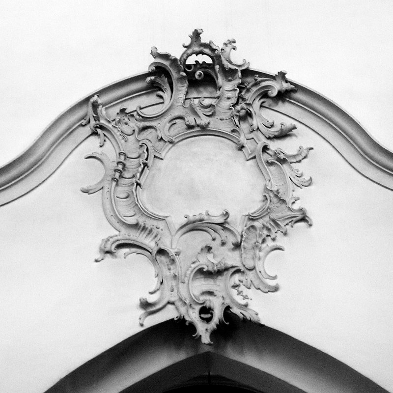
The first image is the staring photograph for Oatmeal. My first impression was that the oatmeal flakes looked a lot like Rococo architectural ornaments. Building on that, I wanted to make a design that resembled a relief sculpture.

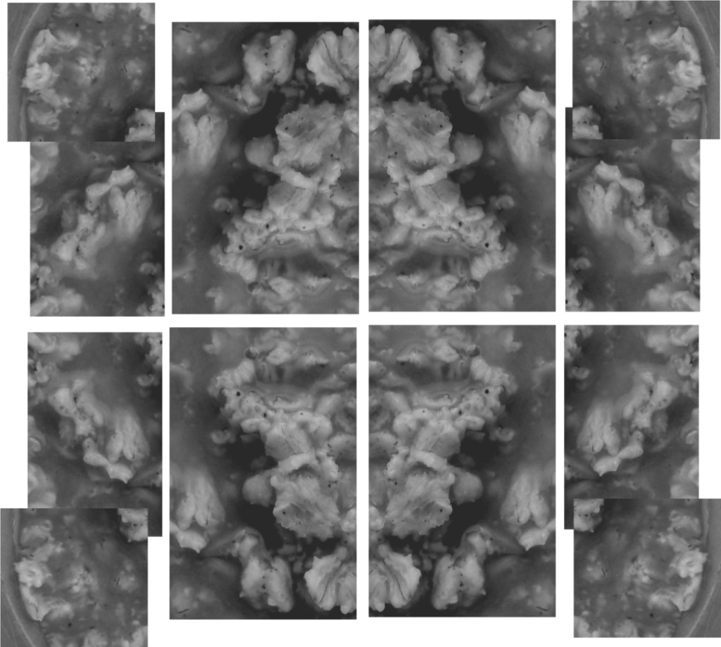
From the starting photograph, I clipped areas that fit the Rococo motif. Then, it was a very fun process of arranging the clippings and editing them to seamlessly form a whole.
I completed most of the final design in one sitting, I was totally absorbed in it and worked on it for hours. I remember listening to Gorillaz’s “On Melancholy Hill” on repeat the whole time. Making it felt like the image had a mind of its own, like I was putting together a puzzle whose final image I did not know from the start. When the little figures in the middle formed, I was pleasantly surprised. I love when faces appear out of nowhere!

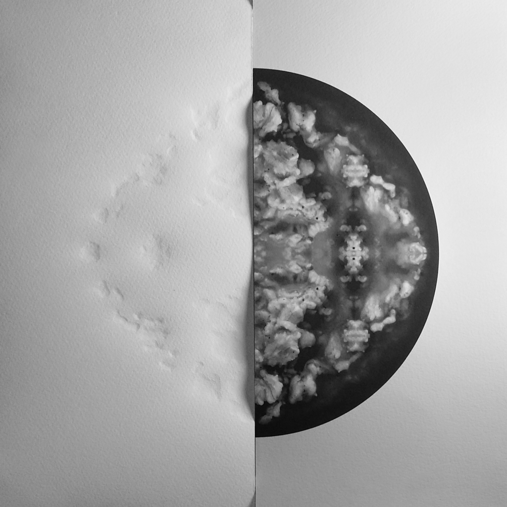
When I started this project I had no intention of embossing the prints, but now, I can’t imagine them without it. It was the result of being REALLY disappointed.
When I printed my first design on paper I was devastated because it looked so flat. What I hadn’t taken into consideration was the fact that the whole time I was making these designs, they were being beautifully back-lit by my computer monitor. What I was seeing on screen could not be replicated on paper.
I knew I needed to distanced myself from the project to find a solution. After a couple of days, I wondered if maybe embossing the prints would give them back some depth. You couldn’t imagine my relief when I saw that, yes, it worked!